7 Invitation Card Design Principles for a Stunning Result
Picture this: Your guests receive an invitation so beautifully designed that they immediately mark their calendars and start planning their outfits. The card sits on their kitchen counter for weeks, serving as a constant reminder of the exciting event ahead. This isn’t just wishful thinking—it’s the power of exceptional invitation design.
In 2025, invitation cards remain one of the most personal and impactful ways to communicate the importance of your event. Whether you’re planning a wedding, birthday celebration, corporate gathering, or any special occasion, the design of your invitation sets the tone and creates the first impression that will linger in your guests’ minds.
Key Takeaways
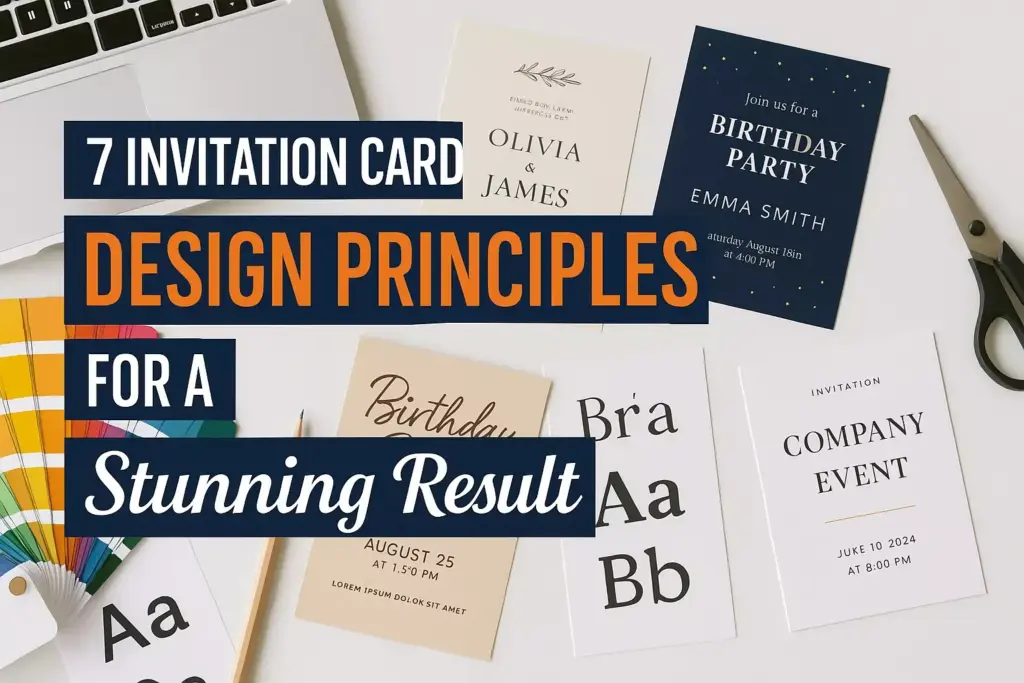
- Typography hierarchy creates visual flow and ensures important information stands out clearly
- Color psychology influences emotions and helps convey the mood of your event effectively
- White space improves readability and creates an elegant, professional appearance
- Visual balance between text and imagery creates harmony and prevents overwhelming designs
- Consistent branding across all event materials builds recognition and professionalism
Why Invitation Design Matters More Than Ever
The art of invitation design has evolved significantly in recent years. While digital invitations have gained popularity, physical cards continue to hold a special place in event planning. A well-designed invitation serves multiple purposes:
- Sets expectations for the event’s formality and style
- Provides essential information in an organized, readable format
- Creates anticipation and excitement among guests
- Reflects the host’s personality and attention to detail
- Becomes a keepsake that guests may treasure for years
Research shows that 78% of event planners believe that invitation design directly impacts guest attendance rates. When recipients receive a thoughtfully designed invitation, they’re more likely to prioritize the event and respond promptly.
1. Master Typography Hierarchy 📝
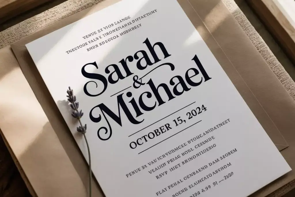
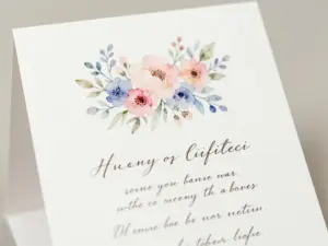
Typography serves as the backbone of any successful invitation design. The way text is organized, sized, and styled determines how easily guests can digest the information and understand what’s most important.
Creating Clear Information Flow
Primary information should always be the most prominent:
- Event type (Wedding, Birthday, Anniversary)
- Host names or honoree
- Date and time
Secondary information includes:
- Venue name and address
- RSVP details
- Dress code or special instructions
Tertiary details encompass:
- Registry information
- Parking instructions
- Weather contingencies
Font Selection Guidelines
Choose fonts that reflect your event’s personality while maintaining readability:
| Event Type | Recommended Font Style | Examples |
|---|---|---|
| Formal Wedding | Classic serif or elegant script | Times New Roman, Garamond |
| Casual Party | Clean sans-serif | Helvetica, Montserrat |
| Children’s Event | Playful, rounded fonts | Comic Sans, Fredoka One |
| Corporate Event | Professional sans-serif | Arial, Calibri |
Pro Tip: Limit yourself to two font families maximum. Use one for headers and another for body text to maintain consistency without creating visual chaos.
Size and Weight Strategies
Establish a clear hierarchy using font sizes and weights:
- Headers: 24-36pt, bold or medium weight
- Subheaders: 18-24pt, medium weight
- Body text: 12-16pt, regular weight
- Fine print: 10-12pt, light weight
2. Harness the Power of Color Psychology 🎨
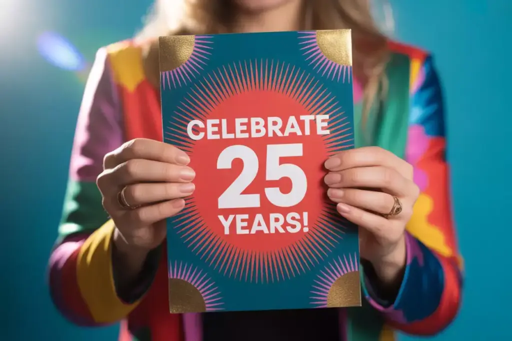
Colors evoke emotions and communicate messages before guests even read a single word. Understanding color psychology helps create invitations that resonate with your intended audience and properly represent your event.
Emotional Impact of Popular Colors
Red conveys passion, energy, and excitement—perfect for romantic celebrations or bold party themes. However, use it sparingly as it can be overwhelming.
Blue suggests trust, stability, and calm. Navy blue works excellently for formal events, while lighter blues suit casual gatherings.
Green represents growth, harmony, and nature. It’s ideal for outdoor events, eco-friendly celebrations, or spring gatherings.
Purple communicates luxury, creativity, and sophistication. Deep purples work well for elegant affairs, while lavender suits romantic occasions.
Gold and metallic tones add glamour and prestige, making them perfect for milestone celebrations and upscale events.
Color Combination Best Practices
Successful color schemes typically follow these approaches:
Monochromatic: Different shades of the same color create subtle elegance
Complementary: Opposite colors on the color wheel provide high contrast
Analogous: Adjacent colors create harmonious, pleasing combinations
Triadic: Three evenly spaced colors offer vibrant yet balanced designs
Cultural Considerations
Remember that color meanings vary across cultures:
- White symbolizes purity in Western cultures but mourning in some Eastern traditions
- Red represents luck in Chinese culture but can signify danger elsewhere
- Consider your guest list’s cultural background when selecting colors
3. Embrace Strategic White Space ⚪
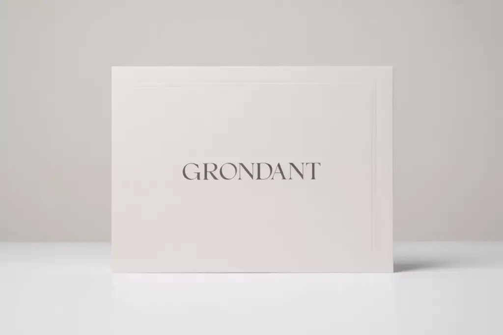
White space, also called negative space, refers to the empty areas around design elements. Many novice designers fear empty space, feeling compelled to fill every inch with content. However, strategic use of white space is what separates amateur designs from professional ones.
Benefits of Proper White Space
Improved readability: Text becomes easier to scan and comprehend when surrounded by adequate breathing room.
Enhanced focus: White space directs attention to the most important elements by eliminating distractions.
Perceived value: Generous white space creates an impression of luxury and sophistication.
Better organization: Proper spacing helps group related information together logically.
White Space Implementation Techniques
Margins and padding: Ensure at least 0.25 inches of margin on all sides of your invitation. For premium feel, increase to 0.5 inches or more.
Line spacing: Use 1.2-1.5 line spacing for body text to improve readability without wasting space.
Element separation: Leave sufficient space between different sections (date, venue, RSVP) to create distinct information blocks.
Image breathing room: Don’t let photos or graphics touch text elements. Maintain clear boundaries between visual and textual content.
4. Achieve Perfect Visual Balance ⚖️
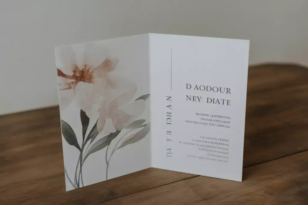
Visual balance creates harmony and prevents your invitation from feeling lopsided or chaotic. There are several types of balance to consider when designing your invitation.
Types of Visual Balance
Symmetrical balance creates formal, traditional layouts by mirroring elements on both sides of a central axis. This approach works well for classic weddings and formal events.
Asymmetrical balance uses different elements of varying visual weights to create dynamic, modern designs. A large image on one side might balance several smaller text blocks on the other.
Radial balance arranges elements around a central focal point, creating circular or spiral patterns. This technique works beautifully for mandala-inspired designs or circular layouts.
Weight Distribution Strategies
Consider the visual weight of different elements:
- Dark colors appear heavier than light ones
- Large elements carry more weight than small ones
- Textured surfaces seem heavier than smooth ones
- Irregular shapes appear weightier than geometric ones
Distribute these weights evenly across your design to prevent any area from feeling too heavy or too light.
Grid Systems for Balance
Using an invisible grid helps maintain consistent spacing and alignment:
Two-column grid: Perfect for traditional invitation layouts with text on one side and imagery on the other
Three-column grid: Offers more flexibility for complex information layouts
Modular grid: Creates sophisticated layouts with multiple content areas of varying sizes
5. Select and Integrate Imagery Thoughtfully 🖼️

Images can make or break your invitation design. Whether using photographs, illustrations, or decorative elements, imagery should enhance your message rather than compete with it.
Types of Invitation Imagery
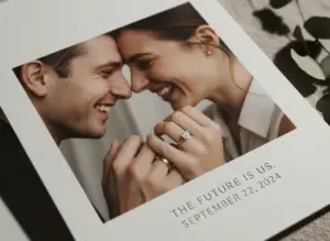
Photography works well for personal events like weddings or milestone birthdays. Use high-resolution images (300 DPI minimum) and ensure proper lighting and composition.
Illustrations offer more flexibility and can be customized to match your exact vision. They work particularly well for themed parties or when you need specific imagery that doesn’t exist in photography.
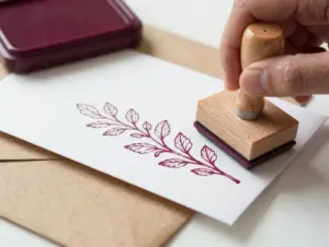
Decorative elements include borders, flourishes, and ornamental graphics that add visual interest without overwhelming the content.
Patterns and textures can serve as backgrounds or accents to add depth and sophistication to your design.
Image Integration Best Practices
Resolution requirements: Always use high-resolution images to ensure crisp printing. Vector graphics are ideal for logos and simple illustrations.
Color coordination: Ensure your images complement your chosen color scheme. Consider applying color overlays or filters to achieve better integration.
Sizing and cropping: Crop images thoughtfully to eliminate distracting elements and focus on what’s most important.
Contrast considerations: Ensure sufficient contrast between images and overlaid text for optimal readability.
Copyright and Licensing
Always use properly licensed imagery:
- Stock photos: Purchase from reputable sites like Shutterstock or Adobe Stock
- Custom photography: Hire a professional or use your own high-quality images
- Free resources: Use sites like Unsplash or Pexels, but check licensing requirements
- Illustrations: Commission custom artwork or purchase vector graphics with commercial licenses
6. Ensure Information Clarity and Organization 📋
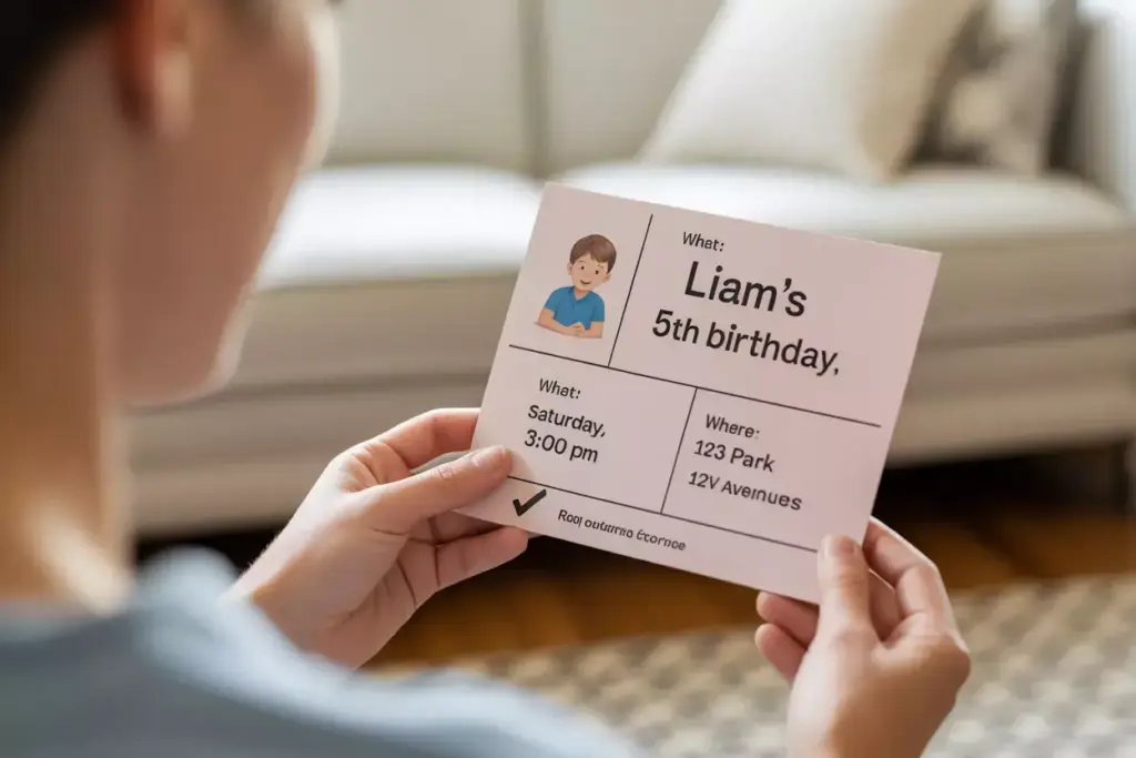
No matter how beautiful your design, an invitation fails if guests can’t easily find essential information. Clear organization and strategic information hierarchy prevent confusion and improve response rates.
Essential Information Checklist
Every invitation should include these core elements:
Who: Host names and/or honoree
What: Type of event and occasion
When: Date, day of week, and specific time
Where: Venue name and complete address
RSVP: Contact method and deadline
Additional details: Dress code, parking, or special instructions
Information Hierarchy Strategies
Lead with the most important: Event type and honoree should be immediately visible
Group related information: Keep date and time together, venue details in one section
Use consistent formatting: Apply the same text treatment to similar information types
Prioritize scanability: Guests should find key details within 3-5 seconds of looking at the invitation
Common Organization Mistakes
Avoid these frequent pitfalls:
- Information overload: Including too many details on the main invitation
- Poor grouping: Scattering related information across the design
- Inconsistent formatting: Using different styles for similar information types
- Buried RSVP details: Making response instructions difficult to find
Digital vs. Print Considerations
Print invitations allow for smaller text since recipients can examine them closely, but require careful attention to print quality and paper choice.
Digital invitations need larger text for screen readability and should include clickable elements for RSVP and directions.
7. Maintain Design Consistency Throughout 🎯
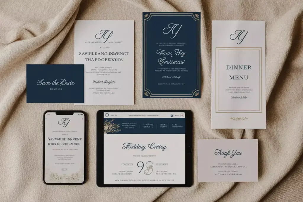
Consistency creates professionalism and helps establish your event’s brand identity. This principle extends beyond the invitation itself to encompass all event-related materials.
Elements of Design Consistency
Color palette: Use the same 2-4 colors across all materials
Typography: Maintain consistent font choices and sizing relationships
Imagery style: Keep photo treatments and illustration styles uniform
Layout principles: Apply the same spacing and alignment rules throughout
Extended Material Applications
Your invitation design should coordinate with:
Save-the-dates: Introduce your color scheme and style early
Wedding websites: Carry design elements into digital spaces
Programs and menus: Maintain visual continuity during the event
Thank you cards: Complete the design journey with consistent follow-up materials
Brand Identity Development
Consider your event as a brand with its own identity:
Logo or monogram: Create a simple mark that appears on all materials
Tagline or motto: Develop a phrase that captures your event’s spirit
Visual style guide: Document your color codes, fonts, and spacing rules
Template system: Create reusable templates for different material types
Quality Control Measures
Before finalizing any design:
Proofread everything: Check spelling, dates, and contact information multiple times
Test readability: Show designs to others and ask if information is clear
Verify colors: Print test samples to ensure colors appear as intended
Check alignment: Use design software guides to ensure perfect positioning
🎨 Invitation Design Quality Checker
Common Design Mistakes to Avoid
Even experienced designers can fall into common traps when creating invitations. Being aware of these pitfalls helps ensure your final product meets professional standards.
Typography Mistakes
Using too many fonts creates visual chaos and reduces readability. Stick to one or two complementary typefaces maximum.
Poor font choices can undermine your event’s credibility. Avoid overused fonts like Comic Sans for formal events or overly decorative scripts for body text.
Insufficient contrast between text and background makes information difficult to read, especially for guests with visual impairments.
Layout and Spacing Errors
Cramming too much information onto one invitation overwhelms recipients and reduces response rates. Consider using separate detail cards for additional information.
Inconsistent spacing creates an amateur appearance. Establish spacing rules and apply them consistently throughout your design.
Poor alignment makes designs look rushed and unprofessional. Use grid systems and alignment guides to maintain precision.
Color and Visual Mistakes
Ignoring color psychology can send wrong messages about your event. Research color meanings before finalizing your palette.
Using too many colors creates visual confusion. Limit yourself to 3-4 colors maximum for cohesive designs.
Forgetting print considerations can result in colors that look different on paper than on screen. Always request print proofs before final production.
Budget-Friendly Design Solutions
Creating stunning invitations doesn’t require unlimited budgets. Smart planning and strategic choices can achieve professional results while controlling costs.
DIY Design Tools
Canva offers user-friendly templates and design tools perfect for beginners
Adobe Creative Suite provides professional-grade capabilities for more advanced users
Microsoft Publisher includes invitation templates and basic design functionality
GIMP serves as a free alternative to Photoshop for image editing needs
Cost-Saving Printing Options
Digital printing works well for smaller quantities and offers quick turnaround times
Offset printing becomes cost-effective for larger orders (typically 100+ pieces)
Online print services like Vistaprint or Moo offer competitive pricing and quality
Local print shops may provide better service and faster delivery for rush orders
Smart Material Choices
Cardstock weight significantly impacts perceived quality—aim for 80-110lb cardstock minimum
Standard sizes (5″x7″ or 4.25″x5.5″) cost less than custom dimensions
Single-sided printing reduces costs while maintaining professional appearance
Bulk ordering often provides significant per-unit savings
Conclusion
Creating stunning invitation cards requires balancing multiple design principles while keeping your specific event and audience in mind. The seven principles outlined—typography hierarchy, color psychology, strategic white space, visual balance, thoughtful imagery, information clarity, and design consistency—work together to create invitations that not only look professional but also effectively communicate your event’s importance.
Remember that great design serves a purpose beyond aesthetics. Your invitation should make guests excited to attend while providing all necessary information in an easily digestible format. Whether you’re planning an intimate dinner party or a grand celebration, these principles will help ensure your invitations make a lasting positive impression.
Next Steps:
- Audit your current design using the interactive checklist provided above
- Gather inspiration from professional invitation galleries and design websites
- Create a mood board that captures your event’s desired atmosphere and style
- Test your design with friends or family before finalizing production
- Plan your timeline to allow adequate time for design, proofing, and printing
Start implementing these principles today, and watch as your invitation designs transform from ordinary announcements into memorable works of art that set the perfect tone for your special events.

