How to Get an Authentic Vintage Look for Your Wedding Invitations
Picture this: you’re holding a wedding invitation that feels like it was discovered in an old treasure chest, complete with weathered edges, elegant calligraphy, and the romantic charm of bygone eras. In 2025, couples are increasingly drawn to vintage wedding aesthetics that tell a story and create lasting impressions before guests even arrive at the ceremony.
Creating authentic vintage wedding invitations isn’t just about slapping an old-fashioned font on cardstock. It’s an art form that combines historical design elements, carefully chosen materials, and thoughtful execution to transport your guests to another time while celebrating your modern love story.
Key Takeaways
- Paper selection is crucial – Choose aged, textured, or handmade papers that feel substantial and authentic
- Typography matters most – Select period-appropriate fonts and consider hand lettering for maximum impact
- Color palettes should reflect the era – Stick to muted, weathered tones rather than bright modern colors
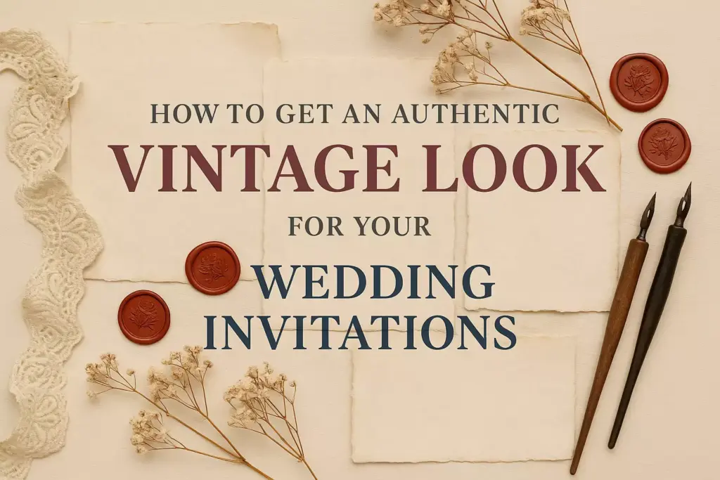
- Finishing techniques add authenticity – Use distressing, wax seals, and vintage printing methods
- Research your chosen era thoroughly – Understanding historical design elements ensures accuracy and authenticity
Understanding Vintage Wedding Invitation Styles
Popular Vintage Eras for Wedding Invitations
Victorian Era (1837-1901) 📜
The Victorian period epitomizes romantic elegance with intricate details and ornate flourishes. Characteristics include:
- Heavy use of lace patterns and floral motifs
- Rich, deep colors like burgundy, forest green, and gold
- Elaborate script fonts with decorative swashes
- Multiple layers and embellishments
Art Deco (1920s-1930s) ✨
This glamorous era brings geometric sophistication and jazz-age flair:
- Bold geometric patterns and clean lines
- Metallic accents in gold, silver, and copper
- Sans-serif fonts with strong, angular characters
- High contrast color schemes
Rustic Vintage (1940s-1950s) 🌾
Post-war charm with a focus on simplicity and natural elements:
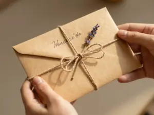
- Kraft paper and burlap textures
- Muted earth tones and pastels
- Hand-drawn illustrations of flowers and nature
- Casual, handwritten-style fonts
Mid-Century Modern (1950s-1960s) 🎨
Clean, optimistic design with a retro twist:
- Bold, simple typography
- Bright but muted color palettes
- Atomic-age inspired graphics
- Minimalist layouts with strategic white space
Choosing the Right Paper and Materials
Paper Types That Create Vintage Appeal
Handmade Paper
Handmade paper provides the most authentic vintage feel with its irregular texture and natural variations. Look for papers with:
- Visible fiber content
- Slightly uneven edges (deckled edges)
- Natural color variations
- Substantial weight (at least 110gsm)
Aged or Antiqued Paper
Commercially aged papers offer consistency while maintaining vintage charm:
- Tea or coffee-stained effects
- Subtle yellowing or browning
- Smooth or lightly textured surfaces
- Various weights available
Specialty Vintage Papers
Consider these unique options for added authenticity:
- Parchment paper – Translucent with an old-world feel
- Kraft paper – Natural brown color perfect for rustic themes
- Linen cardstock – Textured surface resembling fabric
- Cotton paper – Soft, luxurious feel with excellent durability
Material Weight and Texture Guidelines
| Paper Weight | Best Use | Vintage Style Match |
|---|---|---|
| 80-100gsm | RSVP cards, inserts | All vintage styles |
| 110-130gsm | Main invitation | Art Deco, Mid-Century |
| 140-160gsm | Formal invitations | Victorian, Elegant vintage |
| 170gsm+ | Luxury invitations | High-end Victorian |
Typography and Font Selection
Authentic Vintage Font Categories
Script Fonts for Romantic Vintage
Script fonts capture the handwritten elegance of historical correspondence:
- Copperplate scripts – Formal, engraved appearance
- Brush scripts – Casual, hand-painted feel
- Calligraphy fonts – Ornate, decorative letterforms
- Vintage cursive – Flowing, connected characters
Serif Fonts for Classic Appeal
Traditional serif fonts provide timeless elegance:
- Old Style serifs – Gentle curves and moderate contrast
- Transitional serifs – Balanced, readable characters
- Slab serifs – Bold, sturdy appearance for rustic themes
Display Fonts for Era-Specific Design
Decorative fonts that capture specific time periods:
- Art Deco fonts – Geometric, glamorous letterforms
- Victorian ornamental – Highly decorative with flourishes
- Retro sans-serif – Clean, mid-century modern appeal
Typography Hierarchy Best Practices
Create visual interest and readability with proper font pairing:
- Primary heading – Use the most decorative font (couple’s names)
- Secondary text – Choose a complementary but simpler font (details)
- Body text – Select the most readable option (addresses, directions)
Pro Tip: Limit yourself to 2-3 fonts maximum to maintain cohesion and avoid overwhelming the design.
Color Palettes That Capture Vintage Charm
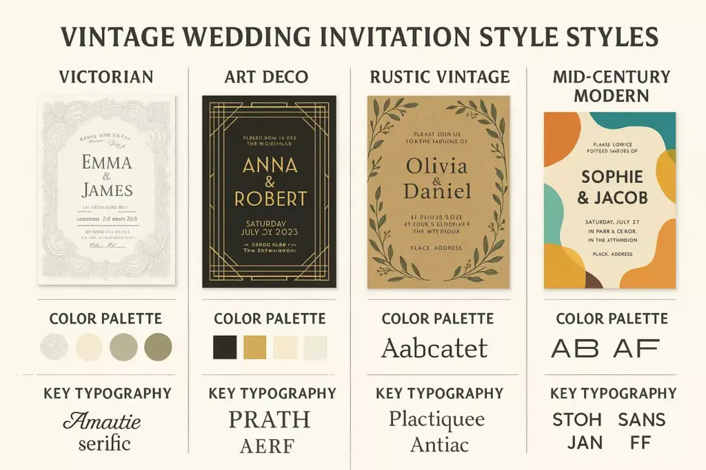
Era-Appropriate Color Schemes
Victorian Romance
- Deep burgundy and cream
- Forest green and gold
- Navy blue and blush pink
- Plum and champagne
Art Deco Glamour
- Black, gold, and white
- Emerald green and silver
- Deep teal and copper
- Charcoal and rose gold
Rustic Vintage
- Sage green and cream
- Dusty blue and kraft brown
- Blush pink and gray
- Lavender and ivory
Mid-Century Modern
- Turquoise and coral
- Mustard yellow and gray
- Mint green and peach
- Orange and cream
Color Application Techniques
Monochromatic Approaches
Using various shades of a single color creates sophisticated, cohesive designs:
- Choose one main color from your era’s palette
- Use 3-4 different tones (light, medium, dark)
- Add metallic accents sparingly
Complementary Color Schemes
Pair colors opposite each other on the color wheel for dynamic contrast:
- Ensure one color dominates (60-70% of the design)
- Use the complementary color as an accent (20-30%)
- Add neutrals to balance (10-20%)
Design Elements and Decorative Details
Authentic Vintage Motifs
Floral and Botanical Elements 🌸
Nature-inspired designs never go out of style:
- Hand-drawn flower illustrations
- Botanical border patterns
- Leaf and vine decorations
- Garden-themed corner ornaments
Geometric and Art Deco Patterns ◆
Structured designs for modern vintage appeal:
- Chevron and zigzag patterns
- Sunburst and fan motifs
- Geometric border frames
- Angular corner decorations
Ornamental Flourishes ✨
Decorative elements that add elegance:
- Calligraphic swashes and scrolls
- Vintage frame designs
- Ornate corner pieces
- Decorative dividers and rules
Layout and Composition Principles
Balanced Asymmetry
Create visual interest while maintaining harmony:
- Place the largest text element off-center
- Balance with smaller decorative elements
- Use white space strategically
- Ensure overall visual weight feels stable
Hierarchical Information Flow
Guide readers through your invitation logically:
- Couple’s names (most prominent)
- Wedding date and time (secondary importance)
- Venue information (supporting details)
- RSVP and additional details (smallest text)
Printing Techniques for Authentic Vintage Appeal
Traditional Printing Methods
Letterpress Printing 📰
The gold standard for vintage invitations:
- Creates debossed impressions in paper
- Produces rich, tactile texture
- Works beautifully with heavy cardstock
- Offers authentic historical accuracy
Foil Stamping
Adds metallic luxury to vintage designs:
- Available in gold, silver, copper, and other metals
- Creates reflective, eye-catching elements
- Perfect for Art Deco and glamorous themes
- Can be combined with letterpress for maximum impact
Thermography
Budget-friendly option that mimics engraving:
- Creates raised, glossy text
- More affordable than letterpress
- Works well with script fonts
- Provides elegant, formal appearance
Digital Printing with Vintage Effects
Aged and Distressed Effects
Modern printing can simulate vintage wear:
- Faded ink effects
- Intentional color variations
- Subtle texture overlays
- Weathered edge treatments
Specialty Inks and Finishes
Enhance digital prints with special treatments:
- Matte finishes for understated elegance
- Spot UV coating for selective shine
- Metallic inks for glamorous accents
- Textured varnishes for added dimension
DIY Techniques for Creating Vintage Effects
Aging and Distressing Methods
Tea and Coffee Staining ☕
Natural aging techniques for paper:
- Brew strong tea or coffee
- Let liquid cool to room temperature
- Lightly brush or sponge onto paper
- Allow to dry completely
- Iron flat if needed
Edge Distressing
Create worn, vintage edges:
- Use fine sandpaper for subtle wear
- Burn edges carefully with a lighter (supervised)
- Tear edges by hand for rustic appeal
- Apply brown ink to simulate age
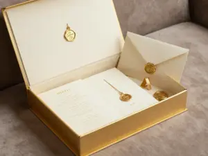
Wax Seal Application 🕯️
Add authentic vintage closure:
- Choose appropriate wax color
- Heat wax stick over flame
- Drip onto envelope flap
- Press seal firmly and hold
- Allow to cool completely
Hand-Lettering and Calligraphy
Basic Calligraphy Techniques
Create authentic handwritten elements:
- Practice basic letterforms consistently
- Use appropriate pen nibs for your chosen era
- Maintain consistent letter spacing
- Add flourishes sparingly for elegance
Modern Calligraphy for Vintage Feel
Adapt contemporary styles for vintage appeal:
- Use slightly irregular letter heights
- Vary ink pressure for natural variation
- Choose period-appropriate ink colors
- Practice on similar paper before final version
🎨 Vintage Wedding Invitation Style Guide
Choose an era to explore authentic design elements
Victorian Era (1837-1901)
Typography:
- Ornate script fonts with flourishes
- Decorative serif typefaces
- Hand-lettered calligraphy styles
- Gothic and Old English fonts
Design Elements:
- Intricate lace patterns
- Floral motifs and botanical illustrations
- Ornamental borders and frames
- Multiple layers and embellishments
Art Deco (1920s-1930s)
Typography:
- Bold geometric sans-serif fonts
- Angular and streamlined letterforms
- High contrast typography
- Stylized script fonts with geometric elements
Design Elements:
- Geometric patterns and shapes
- Sunburst and fan motifs
- Metallic foil accents
- Symmetrical compositions
Rustic Vintage (1940s-1950s)
Typography:
- Hand-written style fonts
- Casual script typefaces
- Slab serif fonts
- Distressed and weathered text effects
Design Elements:
- Natural textures (wood, burlap, kraft paper)
- Hand-drawn botanical illustrations
- Twine and ribbon accents
- Vintage postmark and stamp designs
Mid-Century Modern (1950s-1960s)
Typography:
- Clean, simple sans-serif fonts
- Bold, condensed typefaces
- Atomic-age inspired letterforms
- Minimalist script fonts
Design Elements:
- Atomic and space-age motifs
- Bold geometric shapes
- Boomerang and kidney-shaped elements
- High contrast color blocking
Finishing Touches and Special Details
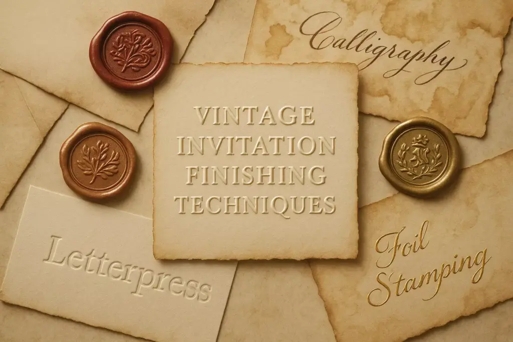
Envelope Treatments
Vintage Postmark Effects 📮
Create the illusion of historical mail:
- Design custom postmark stamps
- Use aged ink colors (sepia, brown, faded blue)
- Apply slightly off-center for authenticity
- Include vintage postal elements and dates
Calligraphy Addressing
Hand-addressed envelopes add personal elegance:
- Use the same font style as invitation
- Choose appropriate ink colors
- Practice consistent letter spacing
- Consider hiring a professional calligrapher
Wax Seals and Closures 🏺
Traditional sealing methods enhance authenticity:
- Choose seals that match your theme
- Use wax colors that complement your palette
- Apply to envelope flaps or belly bands
- Consider custom monogram seals
Assembly and Presentation
Layering Techniques
Create depth and visual interest:
- Base layer – Main invitation on heaviest cardstock
- Decorative layer – Vellum or patterned paper overlay
- Information layers – RSVP cards and detail cards
- Binding elements – Ribbons, twine, or belly bands
Protective Packaging
Preserve your vintage creations:
- Use acid-free tissue paper
- Include protective sleeves for delicate elements
- Choose mailing boxes that prevent damage
- Add “Handle with Care” vintage-style stickers
Budget-Friendly Vintage Invitation Ideas
Cost-Effective Material Alternatives
Paper Substitutions
Achieve vintage looks without premium costs:
- Kraft cardstock instead of handmade paper
- Cream-colored copy paper aged with tea staining
- Textured cardstock from office supply stores
- Scrapbook papers with vintage patterns
DIY Printing Solutions
Create professional results at home:
- High-quality inkjet printer with pigment inks
- Specialty papers designed for home printing
- Online templates customized with your details
- Print shops for small quantities
Time-Saving Shortcuts
Digital Design Tools
Streamline the design process:
- Canva – User-friendly templates and vintage elements
- Adobe Creative Suite – Professional design capabilities
- PicMonkey – Simple editing with vintage filters
- Etsy templates – Customizable vintage designs
Hybrid Approaches
Combine digital and handmade elements:
- Print main invitation digitally
- Add hand-lettered names or details
- Apply physical embellishments selectively
- Use digital aging effects instead of manual distressing
Common Mistakes to Avoid
Design Pitfalls
Over-Accessorizing ⚠️
Avoid cluttering your design:
- Choose 2-3 decorative elements maximum
- Maintain adequate white space
- Ensure text remains readable
- Test designs at actual size before printing
Inconsistent Era Mixing
Stay true to your chosen time period:
- Research authentic design elements thoroughly
- Avoid combining elements from different eras
- Maintain consistent color palettes
- Use period-appropriate language and wording
Poor Typography Choices
Typography can make or break vintage appeal:
- Avoid modern fonts that feel out of place
- Ensure sufficient contrast for readability
- Test font sizes on actual paper
- Maintain consistent spacing throughout
Production Issues
Inadequate Testing
Always create samples before final production:
- Print test pages on chosen paper
- Verify color accuracy across different printers
- Check text readability at various sizes
- Test special effects and finishes
Timeline Miscalculations
Vintage invitations often require extra time:
- Allow additional time for custom printing
- Factor in drying time for special inks
- Plan for potential reprints if needed
- Order samples well in advance
Conclusion
Creating authentic vintage wedding invitations requires attention to historical detail, quality materials, and thoughtful execution. By understanding the characteristics of different vintage eras, choosing appropriate typography and color palettes, and incorporating genuine vintage elements, couples can craft invitations that transport guests to another time while celebrating their unique love story.
The key to success lies in thorough research, careful material selection, and consistent execution across all design elements. Whether choosing the ornate elegance of Victorian styling, the geometric glamour of Art Deco, the natural charm of rustic vintage, or the clean optimism of mid-century modern, authenticity comes from understanding and respecting the historical context of your chosen era.
Remember that vintage doesn’t necessarily mean expensive. With creative DIY techniques, smart material choices, and strategic use of special effects, couples can achieve stunning vintage aesthetics within any budget. The most important element is the love and thoughtfulness that goes into each invitation – that’s what truly makes them timeless.
Next Steps:
- Choose your preferred vintage era and research its characteristics thoroughly
- Gather inspiration from authentic historical examples
- Select papers and materials that support your chosen aesthetic
- Create test samples before committing to full production
- Plan your timeline to allow for custom printing and special finishing techniques

