How to Design a Simple Wedding Invitation with Maximum Impact
The wedding invitation sets the tone for one of life’s most important celebrations, yet many couples struggle to create designs that are both simple and stunning. In 2025, the trend toward minimalist elegance has proven that less truly can be more when it comes to wedding stationery. A well-designed simple invitation can make a more powerful impression than an overly complicated one filled with unnecessary embellishments.
Key Takeaways
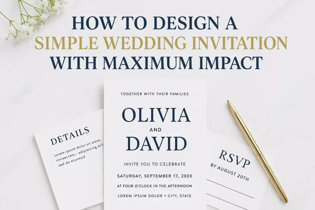
- Typography is king – Choose 1-2 elegant fonts that reflect your wedding style and ensure excellent readability
- White space works wonders – Strategic use of negative space creates sophistication and draws attention to important details
- Color psychology matters – Select a cohesive color palette that evokes the right emotions and matches your venue
- Quality over quantity – Invest in premium paper and printing techniques rather than adding decorative elements
- Essential information only – Include must-have details while eliminating clutter that distracts from the main message
Understanding the Power of Simplicity in Wedding Design
Simple doesn’t mean boring or cheap. In fact, creating a truly impactful simple design requires more skill and restraint than cramming multiple elements onto a page. The most memorable wedding invitations often feature clean lines, thoughtful typography, and strategic use of space.
Why Simple Wedding Invitations Work Better
Modern couples are increasingly drawn to minimalist designs for several compelling reasons:
- Timeless appeal – Simple designs age gracefully and won’t look dated in photos years later
- Cost-effective – Fewer design elements mean lower printing costs and faster production
- Versatile styling – Clean designs work with any wedding theme or venue
- Enhanced readability – Guests can quickly find essential information without visual confusion
Essential Elements of High-Impact Wedding Invitations
Every wedding invitation, regardless of style, must include certain core components to be functional and effective. Understanding these elements helps prioritize what deserves visual emphasis.
Must-Have Information
Primary Details:
- Couple’s names (bride and groom)
- Wedding date and time
- Ceremony location with full address
- Reception information (if different location)
- RSVP deadline and contact method
Secondary Details:
- Dress code or attire guidance
- Wedding website URL
- Registry information (typically on separate insert)
- Transportation or parking instructions
- Accommodation suggestions for out-of-town guests
Visual Hierarchy Principles
Creating effective visual hierarchy ensures guests process information in the correct order:
- Names should be the most prominent element
- Date and time come second in importance
- Location details need clear, readable formatting
- RSVP information should be easily findable
- Additional details can use smaller, secondary typography
Typography: The Foundation of Great Design
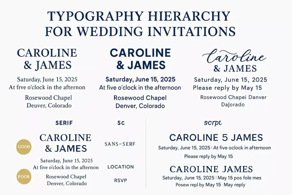
Typography choices can make or break a wedding invitation design. The right fonts convey personality while maintaining elegance and readability.
Choosing the Perfect Font Combination
Primary Font Selection:
- Serif fonts (like Playfair Display or Crimson Text) convey traditional elegance
- Sans-serif fonts (such as Montserrat or Lato) offer modern sophistication
- Script fonts (like Great Vibes or Dancing Script) add romantic flair
Font Pairing Guidelines:
- Limit yourself to 2-3 font families maximum
- Pair ornate scripts with clean sans-serifs
- Use serif and sans-serif combinations for classic appeal
- Ensure sufficient contrast between font weights
Typography Best Practices
| Element | Font Weight | Size Guidelines |
|---|---|---|
| Couple Names | Bold/Medium | 24-36pt |
| Date/Time | Regular | 14-18pt |
| Location | Regular/Light | 12-16pt |
| RSVP Details | Light | 10-14pt |
| Additional Info | Light | 8-12pt |
Readability Tips:
- Maintain adequate line spacing (1.2-1.5x font size)
- Use appropriate letter spacing for script fonts
- Ensure sufficient contrast between text and background
- Test readability at actual print size
Color Psychology and Palette Selection
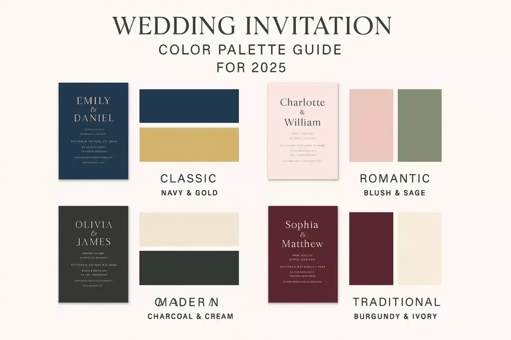
Colors evoke emotions and set expectations for your wedding celebration. Strategic color choices can transform a simple design into something extraordinary.
Popular Wedding Color Palettes for 2025
Classic Combinations:
- Navy and gold – Sophisticated and timeless
- Blush and sage – Romantic and natural
- Charcoal and cream – Modern and elegant
- Burgundy and ivory – Rich and traditional
Trending Palettes:
- Terracotta and sage – Earthy and warm
- Dusty blue and mauve – Soft and dreamy
- Forest green and gold – Natural luxury
- Warm gray and coral – Contemporary romance
Color Application Strategies
Monochromatic Approach:
Use varying shades of a single color for sophisticated subtlety. This technique works especially well with:
- Deep blues from navy to powder blue
- Warm grays from charcoal to light silver
- Greens from forest to sage
Accent Color Method:
Choose one primary neutral (white, cream, or gray) and add one accent color for visual interest:
- Black text on cream with gold accents
- Navy text on white with blush touches
- Charcoal text on ivory with sage details
Layout and Composition Techniques
Effective layout design guides the reader’s eye through information in a logical, pleasing manner. Simple layouts rely on strong composition principles rather than decorative elements.
Grid-Based Design Systems
Centered Alignment:
- Creates formal, traditional appearance
- Works well for church ceremonies
- Emphasizes symmetry and balance
- Best for classic typography choices
Left-Aligned Layout:
- Offers modern, clean aesthetic
- Easier to read for longer text blocks
- Allows for creative white space usage
- Suits contemporary wedding styles
Asymmetrical Balance:
- Creates dynamic visual interest
- Combines different alignment styles
- Requires careful attention to visual weight
- Perfect for artistic, unique celebrations
White Space Utilization
Strategic white space (negative space) serves multiple purposes:
✨ Creates breathing room around important information
✨ Establishes luxury perception through spacious design
✨ Improves readability by reducing visual clutter
✨ Guides attention to key details naturally
White Space Guidelines:
- Leave at least 0.5 inches margin on all sides
- Create generous spacing between information sections
- Use consistent spacing throughout the design
- Allow extra space around the couple’s names
Paper Selection and Printing Considerations
The physical quality of your invitation creates the first tactile impression guests receive. Paper choice significantly impacts the perceived value and elegance of your design.
Premium Paper Options
Cardstock Weights:
- 80-100 lb cover – Standard quality, budget-friendly
- 110-130 lb cover – Premium feel, excellent durability
- 14pt-16pt cardstock – Luxury weight, impressive thickness
Specialty Paper Types:
- Cotton paper – Soft texture, elegant feel
- Linen finish – Subtle texture, classic appeal
- Pearl/shimmer – Adds subtle sparkle without overwhelming
- Kraft paper – Natural, rustic aesthetic
Printing Techniques That Add Impact
Digital Printing:
- Cost-effective for most quantities
- Excellent color reproduction for modern designs
- Quick turnaround times
- Perfect for photography or complex graphics
Letterpress:
- Tactile impression creates luxury feel
- Best for text-heavy simple designs
- Limited color options but stunning results
- Higher cost but premium perception
Foil Stamping:
- Metallic accents add elegance
- Works beautifully with minimal designs
- Available in multiple foil colors
- Combines well with other printing methods
Design Tools and Resources
Creating professional-looking invitations has become more accessible than ever with modern design tools and resources.
Professional Design Software
Adobe Creative Suite:
- Illustrator – Vector-based design, scalable graphics
- InDesign – Professional layout and typography
- Photoshop – Image editing and effects
User-Friendly Alternatives:
- Canva – Templates and drag-drop interface
- Figma – Collaborative design platform
- Affinity Designer – Professional tools, one-time purchase
Template Resources and Inspiration
Premium Template Sources:
- Creative Market – High-quality, professional designs
- Etsy – Unique, customizable options
- Template Monster – Extensive selection
- Adobe Stock – Integrated with Creative Suite
Free Resources:
- Unsplash – High-quality photography
- Google Fonts – Extensive font library
- Pexels – Stock images and graphics
- Freepik – Illustrations and design elements
Common Design Mistakes to Avoid
Even simple designs can fall flat when common pitfalls aren’t avoided. Learning from these mistakes saves time and ensures better results.
Typography Errors
❌ Using too many fonts – Stick to 2-3 maximum
❌ Poor font pairing – Ensure fonts complement each other
❌ Inadequate contrast – Text must be easily readable
❌ Inconsistent sizing – Maintain clear hierarchy
❌ Cramped spacing – Allow adequate breathing room
Layout Problems
❌ Information overload – Include only essential details
❌ Poor alignment – Choose one system and stick to it
❌ Inadequate margins – Leave sufficient border space
❌ Unbalanced composition – Distribute visual weight evenly
❌ Inconsistent spacing – Use consistent measurements throughout
Color and Printing Issues
❌ RGB vs CMYK confusion – Always design in CMYK for print
❌ Insufficient contrast – Ensure text stands out from background
❌ Ignoring color psychology – Choose colors that match your wedding mood
❌ Poor paper choice – Invest in quality materials
❌ Inadequate proofing – Always order samples before final printing
Budget-Friendly Design Strategies
Creating stunning invitations doesn’t require breaking the bank. Smart strategies can deliver maximum impact while maintaining reasonable costs.
Cost-Saving Techniques
Design Simplification:
- Single-color printing reduces costs significantly
- Standard paper sizes avoid custom cutting fees
- Minimal graphics decrease printing complexity
- Digital RSVP eliminates response card costs
Smart Sourcing:
- Online printing services offer competitive rates
- Bulk ordering provides better per-unit pricing
- Local print shops may offer package deals
- DIY assembly saves on finishing costs
DIY vs Professional Services
When to DIY:
- Simple, text-only designs
- Standard printing requirements
- Comfortable with design software
- Adequate time for multiple revisions
When to Hire Professionals:
- Complex design requirements
- Special printing techniques needed
- Tight timeline constraints
- Desire for completely custom work
Wedding Invitation Cost Calculator
Timeline and Planning Considerations
Proper timing ensures your invitations arrive when guests can properly plan their attendance while giving you adequate time for design and production.
Optimal Invitation Timeline
8-10 Weeks Before Wedding:
- Send invitations for local guests
- Include RSVP deadline 3-4 weeks before wedding
- Account for postal delays and processing time
10-12 Weeks Before Wedding:
- Send invitations for destination weddings
- Allow extra time for international mail
- Consider holiday delays in timing
6 Months Before Wedding:
- Send save-the-dates for advance notice
- Begin invitation design process
- Order paper samples and test prints
Production Timeline
Design Phase (4-6 weeks):
- Week 1-2: Concept development and initial designs
- Week 3-4: Revisions and refinements
- Week 5-6: Final approval and file preparation
Production Phase (2-3 weeks):
- Printing and finishing (1-2 weeks)
- Quality control and assembly (3-5 days)
- Addressing and mailing preparation (2-3 days)
Modern Trends in Simple Wedding Invitations
Staying current with design trends helps create invitations that feel fresh and contemporary while maintaining timeless appeal.
2025 Design Trends
Minimalist Luxury:
- Ultra-clean layouts with premium materials
- Subtle texture through paper choice rather than graphics
- Monochromatic color schemes with metallic accents
- Generous white space as a design element
Sustainable Choices:
- Eco-friendly papers from recycled materials
- Digital RSVP integration to reduce waste
- Local sourcing to minimize shipping impact
- Seed paper options for plantable invitations
Technology Integration:
- QR codes linking to wedding websites
- Digital envelope addressing for consistency
- Online RSVP systems with meal choices
- Social media integration for photo sharing
Typography Trends
Modern Serif Revival:
- Contemporary serif fonts like Playfair Display
- Mixed weight combinations for visual interest
- Generous letter spacing for luxury feel
Hand-Lettered Elements:
- Custom calligraphy for names only
- Digital brush scripts for authentic feel
- Minimal flourishes that don’t overwhelm
Quality Control and Proofreading
Attention to detail in the final stages prevents costly mistakes and ensures professional results.
Essential Proofreading Checklist
Content Accuracy:
✅ Spell check all names – bride, groom, parents, venues
✅ Verify all dates and times – ceremony and reception
✅ Confirm addresses – complete with zip codes
✅ Double-check phone numbers and website URLs
✅ Review RSVP deadline and contact information
Design Elements:
✅ Typography consistency throughout all pieces
✅ Color accuracy matches your chosen palette
✅ Alignment and spacing follows established grid
✅ Image resolution appropriate for print quality
✅ Bleed and margin requirements met
Print Quality Testing
Proof Ordering:
- Order physical proofs before final printing
- Test different paper options side by side
- Review colors under various lighting conditions
- Check print registration and alignment
- Verify text readability at actual size
“The difference between a good invitation and a great one lies in the details that guests might not consciously notice but definitely feel.” – Wedding Design Expert
Conclusion
Creating a simple wedding invitation with maximum impact requires strategic thinking rather than elaborate decoration. By focusing on excellent typography, thoughtful color choices, quality materials, and clean composition, couples can design invitations that make lasting impressions while staying within budget.
The key to success lies in restraint and refinement – choosing fewer elements but executing them flawlessly. Whether working with professional designers or creating DIY invitations, the principles remain consistent: prioritize readability, maintain visual hierarchy, and let quality materials speak for themselves.
Next Steps:
- Define your wedding style and color palette before beginning design
- Create a realistic budget including all printing and finishing costs
- Gather inspiration but avoid copying designs exactly
- Order paper samples to test quality and feel
- Plan your timeline working backward from your mailing date
- Invest in professional proofreading for error-free results
Remember, your wedding invitation is often the first glimpse guests receive of your celebration. Make it count by embracing the power of simplicity executed with excellence.

